

Why Customers Drop Off at Checkout: 5 Hidden Mistakes That Hurt Your Conversion Rate
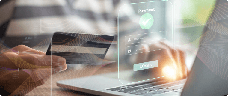
You invested in traffic. The customer selected a product, added it to the cart, and reached the payment page. Then, at the final step, they leave.
According to industry research, checkout abandonment remains one of the biggest conversion killers in e-commerce. In many cases, customers are not rejecting the product — they are reacting to friction in the payment experience.
1. Too Many Fields, Too Much Friction
Every additional field increases the chance of abandonment. Asking for information that is not essential creates unnecessary effort and slows customers down.
Best practice: Request only the information required to complete the transaction, enable autofill, and simplify forms wherever possible.
2. Unexpected Fees at the Last Moment
Nothing damages trust faster than showing a higher price at checkout than the one customers expected.
Additional service fees, taxes, or transaction costs should never appear as a surprise. Customers are far more likely to complete a purchase when pricing is transparent from the beginning.
Best practice: Display the final payable amount before customers reach the payment page.
3. Missing Preferred Payment Methods
Customers expect payment options that match their habits and location. Some prefer cards, others rely on Apple Pay, Google Pay, bank transfers, or local payment methods.
If the preferred option is unavailable, many customers simply leave.
Best practice: Offer payment methods that reflect your audience and display them before checkout begins.
4. Poor Mobile Checkout Experience
Most online purchases now happen on mobile devices. Small fonts, weak contrast, confusing layouts, or forms that do not fit the screen create frustration and reduce trust.
Best practice: Use clear typography, large call-to-action buttons, and test the checkout flow on real devices.
5. Lack of Clear Feedback
Customers need to know what is happening after they click “Pay”. Delays, unclear error messages, and missing confirmation screens create uncertainty.
When users are unsure whether a payment succeeded, they may abandon the process or contact support.
Best practice: Show loading indicators, prevent duplicate submissions, and provide clear success and error messages.
Conclusion
Checkout conversion is not determined by luck. It is shaped by dozens of small decisions that influence trust, clarity, and ease of payment.
Reducing form friction, improving transparency, supporting the right payment methods, and creating a smoother mobile experience can significantly improve conversion rates without a complete redesign.
At Spoynt, we believe checkout should feel effortless. The easier it is for customers to pay, the more likely they are to complete the purchase.
Want to evaluate your checkout experience? Contact the Spoynt team and discover opportunities to improve conversion and customer satisfaction.

Latest News
See all articles-
 Education
Checkout Clarity Is the New Competitive Advantage
17 March, 2026 -

Is Your Payment Stack Holding You Back? Here’s How to Tell
29 September, 2025 -
 Education
Diversifying Payment Options for Business Success: A Guide
30 July, 2024